Over the last couple of weeks I have been sharing one of my
client’s homes that I recently designed.
Today is the last installment…their Dining Room. The house has a Breakfast Room
and a Formal Dining Room and during our initial consultation we discussed using
the Formal Dining Room as a home office as it better suits their needs as a
family. This means the Breakfast
Room is their main space for family meals and entertaining. Although they selected the Designs
Online service for their office, which you can see here, for their Dining Room
we went with the full service design option.
Here is how the Dining Room started…plain walls, drapery
panels from the previous owners (that are hung way too low if you ask me) and a
curvy, iron light fixture. Definitely
time for an update! Good news is that
it has great bones and we got to start from scratch!
With the Dining Room being open to the Family Room they
needed to have continuity so to connect the two spaces I continued with the
mid-century modern style and vibrant colors. Here is a picture of the Family Room so you have an idea of
what it looks like. You can check
out the full post here.
One specific comment from the client was that they wanted a
conversation piece in here. You
know…something people will talk about when they are over. That is where the light fixture comes
into play. I selected this luster
glass orb fixture from West Elm.
Ummmm…hello? If that
doesn’t get you talking I don’t know what will! We did relocate it so it was centered over the table because
it just was not practical being in the dead center of the room.
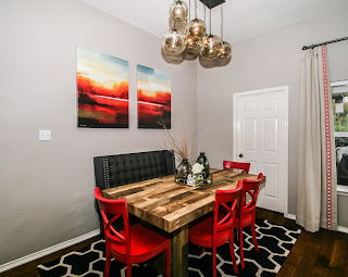
To bring in a rustic, industrial touch I used a distressed
wood table (which will also be great for hiding stuff)! And for the banquette, we opted for a furniture
piece instead of a built-in one so they would have options to change it in the
future. The bright pops of color was
brought in through accessories, the large art on the wall and the red “X”
chairs. Aren’t they fun and
fabulous?!? And by using the same
fabric and trim for the draperies as we did in the Family Room it really ties
the two spaces together.
Adding any other furniture would have made the room feel cramped
so we added some shelving on the walls to add some weight and bring in some
additional accessories.
Here it is one last time. I just love it and hope the Phillips do as well!
What do you think…would you
want to dine in such a beautiful, vivid space?


No comments:
Post a Comment