Tuesday, November 10, 2015

SHARING SPACES WITH YOUR KIDS

What do you do with all of your kids toys and things if your home does not have some sort of Game Room?  Do they overtake any rooms or even your entire house? #sometimesIfeelliketheydo I am a believer in the fact that if it doesn’t fit in their room or closet it probably isn’t necessary.  Fortunately Oliver was blessed with a giant closet and he has a toy chest in his room!  And Owen shares a lot of Oliver’s toys so his closet is ample space for his larger toys.

But I also don’t want them to feel confined to only playing in their room.  I love that they want to spend time playing in the Family Room where we can all be together.  That being said I don’t like staring at children’s toys all day long when they are not home or after they go to bed at night.  I mean…my husband and I are adults (even though we don’t always act like it!) and this is our place to relax also! 

So I needed a place in the Family Room to house toys.  There are a few small drawers in our media console that we have some puzzles and books in but I needed something larger and more substantial.  AND…I wanted it to look nice in the room but not be expensive because my two little rug rats would be beating it up for sure!

There are so many different options out there it was hard to decide what would be best for us.  You can go with cubby storage like this one from Pottery Barn.  And believe me…there are a ton of options out there for this kind of thing.


Or how about a wooden trunk?  The Tucker Trunk from Crate & Barrel is a striking combination of paneled wood with an iron base.  And it would even make a fabulous coffee table!


For our situation I wanted something that would hide more than the cubbies but was not as large as the trunk.  So I opted for a woven storage chest.  The best news is that I bought it from Overstock and it was less than $100! It is very sturdy and has held up really well considering how tough my little guys can be with things!


Not that the house looks perfect every night but I love that we have a place to keep their things.  Let me know what you do to keep your space still feeling “adult” while letting your kids enjoy it also!

Tuesday, October 27, 2015

CHOO CHOO CRATE STORAGE

This beautiful Tuesday is a project day for me!  Last week I shared with you the spicerack bookshelves in Oliver’s room and today I am updating a different project I completed. 

Oliver has had a love for trains for the last couple of years so we put a wood children’s table in his room that has a train table on the top of it.  One thing this boy mom has discovered is that with a train table comes A LOT of trains…like every single Thomas the Train character!  #whatevermakesthemhappyright  I wanted the trains and train tracks to have their own home so they weren’t mixed in with all of his other toys so I decided on the ever-so-popular wooden crates to store them in.  I ordered these unfinished ones from Home Depot so I could do what I wanted to with them.


The first go around I stained them with a warmer brown color and used a black glaze, which ended up being similar in color to the table.  And because they were going under the table the wash of brown wood drove me crazy.  It was just so boring.  They were not bought together and I wanted them to be different from each other.


Now that I am finally getting around to finishing up his room #ayearlater I am refinishing the crates.  To make them stand out from the table I painted them black.  They also needed to be easier to move in and out so I drilled some holes and added rope handles and put casters on the bottom. 


And here they are now under the table.  I hope Mr. Oliver likes them!


I like the look of it so much better now that there is contrast.  And since the update was free and they function better, it's a win-win overall!

Tuesday, October 20, 2015

BOOKS, BOOKS, EVERYWHERE!!

Between Kindles and IPads and other computerized devices do you ever feel like technology has taken over picking up an actual book?  Fortunately, that is not the case for my son.  Oliver, my 4-year-old, loves to read (can’t complain about that!) and with that comes a lot of children’s books. 

When I redecorated his nursery to a big boy room this was one problem I wanted a solution for.  And of course I wanted a cute and creative way to display them…duh!  Kids books are full of color and since they are all different shapes and sizes they make for great kids room décor.  Here are some cute ways I came across to store books in a playroom or kids bedroom.

A bright Utility cart is perfect for storing books and since it is on rollers it can easily be moved from one place to another.


This wagon from Restoration Hardware is adorable!  You can easily make it sentimental by using your own wagon from when you were a child or find one that coordinates with the style of the room.  The options are limitless!


I have also seen picture ledges used for this type of storage a lot.  You can get simple white ones or paint them a variety of colors for a little more excitement!


The route I chose to go was by using spice racks.  They are very similar to picture ledges but are generally shorter in length and have a bar across the front to help keep the books from falling.  I needed something for the walls versus the floor and didn’t have a lot of wall space so this was perfect.  There are so many tutorials on the web on how to create this project and it really was very easy.


I measured the space and purchased five of these spice racks from IKEA. 


Since they came unfinished I put them together, which was surprisingly easy to do, grabbed some gray paint I had in our paint cabinet and slapped a couple of coats on them.


After they were all dry I hung them on the wall and put up some books!


Not all of his books can be stored here but it is great for grabbing a bedtime story and I think it looks pretty cute too!  Where do you keep all of your kids’ books?

Tuesday, October 13, 2015

HAUNTING UP OUR HOUSE

We are already in middle of October and that means Halloween is creeping up!  Not long ago I showed you guys my spooky finds while I was out shopping (see post here).  Like I said before I have never decorated much for different holidays or seasons but this year I am thrilled to so!  Today I am taking you into our house and the Halloween decorating I have done.  I am on a budget so I didn’t go too crazy…just added some things to the Dining Room, fireplace mantel and a little something to the coffee bar.
It started with finding a life-size skeleton that I would be able to spray paint gold to look similar to this guy from Grandin Road.  I just couldn’t fork over $99 for their skeleton.  Instead I found one at Target for $40 and since gold spray paint has a permanent residence in my garage he was mine!  Oliver, that’s my 4-year-old, decided his name needed to be Mr. Bones!  So here is Mr. Bones before and after!  Kind of creepy just hanging out in the yard, huh?


With the exception of the skeletons all of the Halloween decorations came from Hobby Lobby and Dollar Tree.  In the Dining Room Mr. Bones is definitely the main focus.  And since he is gold I kept all of the accessories black and gold in there.  I painted paper mache “BOO” letters gold with different patterns of black for a little variety.  Leaving them all the same height on the table was too boring so I used small boxes and covered them with black netting.  The bobble head skulls were from the dollar store and I knew they would be great if they were only gilded! A black raven, mini pumpkin, witch hat and fun candles finished up the tablescape!


On the coffee bar this  $1 pumpkin became black with a gold stem.   My usual woven basket that holds my coffee pods was traded for a spider web bowl and filled with webbing and candy corn…YUMMY!! 


My biggest DIY project for all of the seasonal décor was the haunted houses.  When I saw theseat Pottery Barn I knew I wanted some on my mantel.  I purchased unfinished house in different sizes from Hobby Lobby and painted them.  They aren’t as fancy as the PB ones but at least I don’t have glitter everywhere!  The windows and doors were all open so I covered them with wax paper.  Toss in a flameless candle at night and they glow!  And at half off they only cost about $8…totally worth it!


And here are the houses on the mantel, which actually turned out to be my favorite!  The houses are sitting on a black feather boa and the skull and raven are on top of vases covered in faux webbing.  While I was at Target I saw a smaller version of Mr. Bones and he literally leapt into my basket!  Don’t you hate it when that happens?!?  In case you are wondering his name is Baby Bones…gotta love how kids name everything! 


I hope you like it all and I would love to see pictures of your Halloween decorations!  For me, this turned out to be a win…it was inexpensive to do, did not take too much time to put together and has gotten our household in the spirit! 

Thursday, October 8, 2015

DESIGNING FROM DALLAS TO CHICAGO

Don’t you love that so many things are easily available through technology and the Internet?  When it comes to the interior design world it is very helpful as I am able to help design spaces from many miles away.  So when some good friends of ours, who happen to live in Chicago, contacted me to help them with the Family Room in their new home I knew the best option for them would be the Designs Online service.  If you are curious, the Designs Online service are provided with a Virtual Design Board giving you a visual of the room put together, a furniture plan with details and a shopping list with specific information about the items and where to buy them.

She sent me measurements, photos of the room and inspiration pictures of the décor style she likes.  Also knowing they have a beautiful 2-year old daughter, the most adorable baby boy and two sweet pups I needed to make sure to use items that will hide stuff, hold up well and not be too expensive or fragile as it will take some abuse!  I am a true believer in having your home be beautiful and family friendly at the same time and all at a price that is not too harsh on your wallet!

Here is the design board and furniture plan.  You can see we kept the color tones neutral with pops of metallics…golds, silvers and iron. 


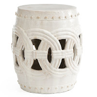
The garden stools and ottomans will provide additional seating when they entertain.  And the ottomans are not only used for the coffee table and extra seats but also provide storage for whatever they may need.  It would be a great place to hide a few of the kid’s toys!


The furniture is a darker gray and taupe to hopefully hold up with the wear and tear it may eventually see.  Since it is a bit darker I used a tall floor lamp and two large antiqued glass lamps to brighten up the room and the tall floor mirror will bounce light off and help it to feel more open.


You can see from the furniture plan that one of the challenges of this room is that it is extremely long…as in 25-feet long.  So I chose to do two separate seating spaces.  One that gives them a space to relax and watch TV and another with accent chairs to sit and chat with a guest or just kick your feet up and read a good book (or gossip magazine!).  Having two different rugs helps to create two spaces in one room that coordinate and flow together but also can be seen as their own individual areas if needed.

Here it is one more time.


I can’t wait to see how it all turns out!

Do you think something like this can be helpful for you?  The benefits of the Designs Online service is that you get the advice of a professional no matter where you may reside, you can purchase the items on your time schedule and it is a more cost conscious interior design service!  And if you like to DIY but want the guidance and information provided to you this is the perfect option!

If you are interested in Designs Online please contact me at tessa@interiorsbytessa.com.  Hope to hear from you soon!

Tuesday, October 6, 2015

TO TELL THE TRUTH

Do you believe that honesty is the best policy?  We are working on teaching that to my 4-year old son right now.  #mommyprobs  Practicing what I preach, today I am going to tell you the truth about a recent DIY project of mine.  I am going to share with you the good, the bad and the ugly I don’t really love how that turned out!

Several months ago I removed the doors from the upper cabinet in our Guest Bath.  We have plenty of storage space in the sink cabinets so it was nice to use this as a place for decorative accessories and it also helped open the room up!

When we moved in I had the cabinets painted a classic white which is so versatile but lately I have wanted to add a little something more.  I felt like the cabinets needed some punch!  But how do I go about it…paint them a contrasting color, paint the backs a darker color or maybe use some kind of wallpaper on the background?  I wanted a wallpaper look without the permanence so I chose to take it on myself. 


I have seen so many tutorials on the web about painting or using fabric or cardboard on the backs of cabinets and bookshelves.  I don’t claim to be the greatest of crafters but I can handle this right?


I bought plain, white mat board and a fun stencil from Hobby Lobby and decided to paint it charcoal gray and white. 


Here is the good news…it was really inexpensive to do and only took about 2 hours (with dry time).  I started by making the background gray and then stenciled with white. 


Once it was dry, I cut it to the appropriate size and attached it to the back of the cabinets.


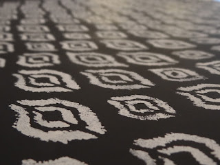
EEK!  I would say I nailed the contrast and punch look that I was going for but to be honest it is a little too loud for my house.  The Aztec Ikat pattern is definitely on trend but it belongs in a house with a lot of vivid color and more modern style.  And I like to think of myself as a fun-loving person with a passion for life but when it comes to my personal interior décor style I am captivated by neutral combinations.

Back to the drawing board…womp womp.  I’m not going to lie…I hate redoing these projects but I just can’t settle or live with this.  Knowing the process was easy I went about it similarly except instead of painting I found some nice wrapping paper at The Container Store and covered the board with it using spray adhesive.  The paper has a metallic finish and a more subtle pattern.


Not only was the outcome better in my opinion but it took less time (45 minutes) and created much less of a mess.  Which one do you like better?  Thanks for letting me be honest about my crafty projects that don't always go as planned!